my pictures

And it's over...


© 2008 Bert Rodriguez. The End-A project installed during the Whitney Biannual. As someone passes through the opening doors of the elevator a motion sensor triggers an endless looping soundtrack. The soundtrack was designed by the artist created from sections of end theme music from films. As the artist sees newer movies, more music is added until his death when the soundtrack will become completed.

Well, It's the end of many things now for me. School is finished. The Thesis Exhibition is down. And Summer access to the School's Computer Lab and printers is also over because they are renovating many parts of the school. So, we are now officially locked out from using the lab like we did last year to work on summer projects.

For now like so many photographers in New York I will be using Print Space when I need to make a work print or scan some film. While it is surreal that School is finished - with the end of school brings the excitement of the challenges ahead. It's terrifying graduating now but at least the economy appears to be getting better. If I had graduated last year we would have been flying into the job market as the economy entered the worst collapse since the great depression. Hopefully, that is behind us and jobs will be coming back to all the working photographers and artists. And collectors will begin to buy more of the art that they enjoy. Go stock market go!

I'm really happy with how our Thesis Exhibition turned out. It was sad to bring home the work but the end also means new beginnings for me and the development of the series. Check out all the great blog love we got below. Thanks to all the bloggers who posted the information for the show or posted links to their favorite artists.

Press from the SVA MFA 2009 Thesis Exhibition
whats the jackanory ? - sva mfa show
Two Days Left for SVA MFA '09 Show | Gallery Hopper
ArtCat - Chelsea - SVA (West 26th) - MFA Photography, Video and Related Media Department presents Thesis Exhibition
Hey, Hot Shot! - SVA MFA 2009 Thesis Show
SVA (West 26th): MFA Photography, Video and Related Media Department presents Thesis Exhibition | .FILAS, n{e}ws
Recent MFA Shows' Selections. | digressions: a blog
Zoe Strauss: SVA MFA Photo Thesis Exhibition
wan.der.lust.ag.ra.phy
Schauraum 3 – thesis show at the FH Dortmund « Daniel on photography
SVA.MFA. « Prison Photography
ARTmostfierce: SVA 2009 MFA Thesis Exhibition
The Exposure Project: Jessica Bruah's No Lake This Summer
Tina Schula - Conscientious
Maureen Drennan - Conscientious
Carlos Alvarez Montero - Conscientious
i heart photograph: yiftach belsky
School of Visual Arts MFA Photography and Related Media Thesis Exhibition | Artis

As for this blog I hope to keep it up. I have been thinking about what it should morph into now that school is out. I will be experimenting with taking some of the papers I have written in school and turning them into long blog posts. If they work I will continue to write longer articles on art in this blog in the future. So, to recap, an end is sad but the beginning is terrifyingly exciting. To quote my favorite wordsmith:

"What is that feeling when you're driving away from people and they recede on the plain till you see their specks dispersing?--it's the too- huge world vaulting us, and it's good-by. But we lean forward to the next crazy venture beneath the skies." -Jack Kerouac

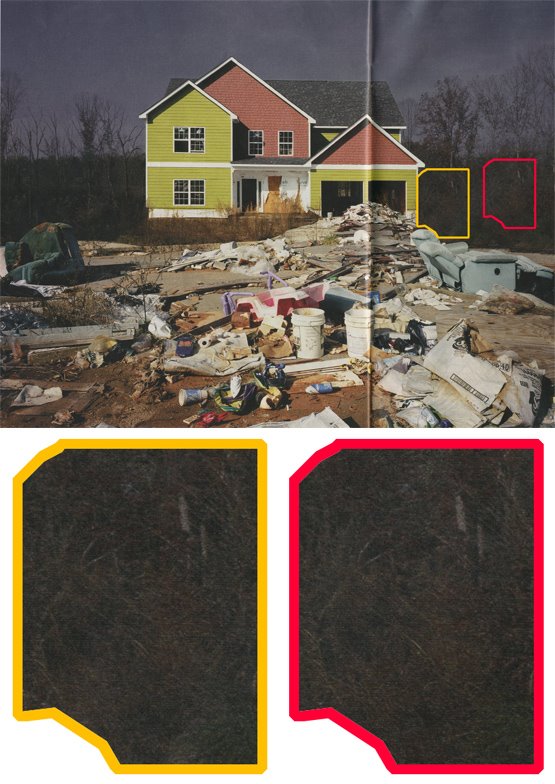
Ruins of the Second Gilded Age or Ruins of Bad Retouching


Photo: Edgar Martins for The New York Times

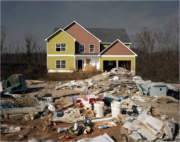
I recently came across a New York Times Magazine picture essay by photographer Edgar Martins published in the Time's Architecture Issue called "Ruins of the Second Gilded Age." I have always been interested in the built environment, especially in relation to suburbia. For too long now America has over-relied on designing cities for cars and not people. This design practice has led to an unsustainable housing dream.

The New York Times story featured quiet pictures of abandoned construction sites. Overzealous devolopers had left these building projects in this economic downturn and turned them into ghost houses. When the 5th image loaded (see above) I was struck by the aesthetic similarity to my own project, affordable homes (see below image).

affordable homes
©2004 harlan erskine, '#14967 B 26/58', c-print, 20 x 25 inches from the triptych affordable homes

My image was taken as the real estate market was heating up in Miami. Developers were building huge clusters of McHomes closer and closer to the everglades and in areas that used to be farmland. The homes have been finished by now. At least one resident has occupied them since their completion. I made the images out of frustration with the banality and cheapness of their design, construction and planning. How can we look at these creations as Americans and not ask: is the future we want? Building homes in this manner is unsustainable--a fact that we are only beginning to digest as a nation. The results of these careless choices will reverberate through our economy for generations.

The images by Edgar Martins warranted a blog posting. I pasted the links into Blogger with a quick outline and saved it for a later posting. I experienced all these images on the small screen and have yet to see the printed version. If that was the end of this story, this post would end here. Tonight as I revisited the links, I loaded the Time's webpage and found a note from their editors.

Editors' Note: July 8, 2009

A picture essay in The Times Magazine on Sunday and an expanded slide show on NYTimes.com entitled "Ruins of the Second Gilded Age" showed large housing construction projects across the United States that came to a halt, often half-finished, when the housing market collapsed. The introduction said that the photographer, a freelancer based in Bedford, England, "creates his images with long exposures but without digital manipulation."

A reader, however, discovered on close examination that one of the pictures was digitally altered, apparently for aesthetic reasons. Editors later confronted the photographer and determined that most of the images did not wholly reflect the reality they purported to show. Had the editors known that the photographs had been digitally manipulated, they would not have published the picture essay, which has been removed from NYTimes.com.

The photography blogosphere has eaten this story up. PDN Pulse has a long post will several updates running down when the issue was discovered and outlining the offending retouching in a print version of the story. Other photography / art bloggers a photo editor, Gallery Hopper, the online photographer, art most fierce, Joerg Colberg and industry pub Editor and Publisher all have good coverage mixed with their thoughts about this controversy. And now the big bloggers have weighed in with posts from Talking Points Memo, a political blog, Gawker and even the New York Times photography blog, Lens writing about the story from the inside out. (damage control?).


from the PDN Pulse.

With countless more blogs weighing in I figured I would give my two cents.

First, I could care less that an aesthetically manipulated image is illustrating a magazine article. As long as the image is truthful, the alterations don't detract from the article. The photographer has been quoted in many of the above posts as saying, "When I photograph, I don't do any post production to the images, either in the darkroom or digitally, because it erodes the process. So I respect the essence of these spaces."

Why mention it at all? I don't see Gursky or Burtynsky making a big deal about their retouching. Why should anyone? Unless the artist made inept use of Photoshop, there is no problem. Sure, it's not as bad as Iran's retouching missiles or the offenders in this Gawker post, but who really cares? This type of retouching wouldn't fly with any creative director in the advertising business. The art world would laugh at it.

The sad thing is this story is now lost. Before this controversy was discovered by a few Metafilter watchdogs, people were discussing the content of the article. Has this "Second Gilded Age" ended? These discussions were getting some coverage with sites like Tree Hugger and the Times' dot earth. I find it sad that something like this happens and immediately hundreds of commentators flood the blogosphere. Why weren't we discussing it on this level before? What's a more important issue--the economy and the environment or bad retouching by an artist wearing a journalist's hat?

To bring it back to those thoughts, I will point you to a quote posted in the tree hugger blog:

Andy Revkin, who asks:

Are these portraits, perhaps, of the end of the age of unfettered consumption, simply a short pause before human communities resume their 150-years-and-counting fossil-fueled sprint, or a foretaste of Alan Weisman's 2007 thought experiment, "The World Without Us"?

If you want to see the images, the Times still has them up on their site without captions. Just go to this url and change the ending number to access each image.

http://graphics8.nytimes.com/images/2009/06/30/magazine/05gilded.1.jpg