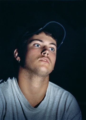
Robbie Cooper for The New York Times, “Name Alexander Kinch Age 12 Location Grimsby, England Game Call of Duty 4”
Last weekend's New York Times Sunday Magazine had a video piece made by Robbie Cooper that captured my attention. I was first drawn into the article through the stark images of the video gamers staring straight back at me. Then I fount the Immersion piece and was struck with the video more then the stills. While the stills are dramatic and leave a fair amount of ambiguity for the viewer to figure out the video adds the sequence of expressions that build into a more interesting piece on video games. I could see a little snippet of the player's personality in a more dramatic, unexpected and natural way then when it was a frozen moment.
The subject and viewer's gaze were a critical component to this project's success. Cooper utilized an Errol Morris technique of filming that Morris' wife termed the Interrotron. This method allows the subject to stare straight into the camera's lens wile being distracted by viewing the interviewer in front of the camera (diagram). In this case, Cooper has placed the video game screen in place of the interviewer.
Jorg Colberg has almost the complete opposite view, arguing this is a case where photography is superior to video. This depends upon the intentions of the artist. Ultimately the success of the project depends on the right selection of media, an interesting expression and a skilled and appropriate technical application. In this case I am more interested in the moving images of the video gamers as opposed to the static images made from the video. I appreciate ambiguity in the stack images in this case but I'm more drawn to the emotion (or lack thereof) expressed in the moving images.

Shauna Frischkorn“Robert (Playing Smuggler's Run 2: Hostile Territory),” C-Print, 40x30 inches
Jorg also pointed out that Shauna Frischkorn deals this the same subject–video games–but due to her use of stills, he preferred her images. I took a long look at her images of gamers. They didn't work for me. Maybe it’s the was they are reprinted on the internet. I am trying to imaging what they would look like at 30x40 sized on the wall, assuming they will hold up to the enlargement. Maybe this is a situation where the print is vastly better then the net? Still, the subject's gaze above the viewer isn't as strong as the direct gaze of Cooper's images.

Phillip Toledano, “Video Gamers”
While I was researching Shauna Frischkorn's work, I noticed she was a Fall 2007 Hey Hot Shot Winner. In the comments section of the announcement post I was pointed to Phil Toledano Gamers series, which have the opposite gaze of Frishkorn's subjects. Toledano's Gamers are looking downward toward the screen with extremely expressive faces subtly shifting the gaze and the viewer’s reaction to them.
All of the photographers mentioned above have taken slightly different topological approaches to the same subject of video gamers. Which brings me to the work of Todd Deutsch.

Todd Deutsch, “Gamers”
Deutsch's approach builds a story of gamers. The image above also fits into a similar category as the other images do, but he also takes a variety of other images: Landscapes of computer chaos, still life images of gamer trash and portraits from varying distances. I'm still digesting which approach is the best one here but its really interesting to see one contemporary subject from four (any more out there?) perspectives.
In the end who wins? The artist who first thinks of the project, the artist who executes it the best or something else I am not thinking of?
