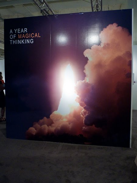
Penelope Umbrico, 4,786,139 Suns from Flickr (Partial) 1/14/09 2007-2009 4 x 6 inch machine prints (detail).
Every artist has to grapple with the question: Is your work original? Some say that no artwork is original. This statement is a cop out. Originality still exists and flourishes. A lot of original art grows out of looking at other works and reacting to it. The danger is when the artist finishes a project and knowingly or not comes up with work that is too derivative or even plagiarized from others.
Last week at a talk benefitting the Camera Club of New York, artist Penelope Umbrico talked about her work to a packed house at SVA. Her art is a remixing of photographic media into a dialogue about the larger culture of photographic consumption. For her project, Suns from Flickr, she utilized the abundance of sunset images uploaded to the popular photo sharing site, Flickr. Through a careful cropping and arrangement, she remixed their original purpose, transforming them into a random wallpaper of candy-colored sunsets.
When her exhibited work was uploaded back to Flickr, some viewers were offended by the appropriation (remixing), thus missing the point of the project. Umbrico's Suns has a very different intent from those who uploaded their pictures to Flickr. The art is not simply the imagery; it is the sum of the parts used to illustrate an idea. There might be artistry to mixing a tube of paint, but I have never heard a paint manufacturer claim that an artwork was partly theirs, since they formulated the paint.

Richard Prince, "Untitled (Cowboy)."
Another case is the appropriation of photography by Richard Prince of Cowboy images from Marlboro ads. Recently, A Photo Editor interviewed one of the photographers, Jim Krantz about Richard Prince. If you have not read the interview, check it out here. While I appreciate Jim's work, Prince has appropriated it differently than the work for which Krantz was commissioned. These images began as an advertisement for cigarettes. Marlboro used Krantz's fantastic images of the American cowboy to sell a product that has killed thousands of people. Marlboro combined these images with their logo to sell the idea that smoking their brand of cigarette was a classic American thing to do. The freedom of the American West was equated to the act of smoking. Thus, these images were no longer about anything but the lowest form of propaganda. They were selling death, plain and simple.

Jim Krantz's "Calf Rescue" (1998), taken on assignment for Marlboro.
Richard Prince's re-photography of these advertisements significantly shifts their meaning. In Prince's Cowboys, the work begs the question, What is real? Prince peers into the American veneer of the cowboy and calls it fake. In his new work, the viewer can identify the copied surface in the pattern from the advertisement. Logos have been removed. All that is left is the idea of the American cowboy. His new work is about questioning the authenticity of both the myth of the cowboy and the honesty of that idea.
In A Photo Editor's Interview:
APE: But, that's the irony isn't it. Someone steals a photograph and suddenly your work is important to the art community. That's what it took.It's amazing to me that the curators at the Guggenheim would bring this work in without acknowledging the source or giving the viewers the opportunity to see what motivates and inspires a person. You need a footnote in a paper but there's no source recognized here.
As a photographer I understand the desire for credit. I have certainly felt the sting from not getting credit for something. But we need to remember there was no byline in the ad. Marlboro paid thoroughly for these ads. It's difficult to feel for the photographer who became part of the cancer stick propaganda machine. He sold out his images literally and complained when they were used as paint for someone else's artistic expression. If anything, Krantz is lucky. His images could have easily been forgotten, lost to the void of time. Because of this controversy he has gained recognition, the chance to make some work express his artistic intentions, and receive a wider audience than he might have received without this experience.
Recently, another controversy over originality has been getting attention. This is a case among fine art photographers. The playing field is a bit different. Jorg Colberg has written a lot about this in his blog, specifically in the posts "On Plagiarism and Similarities" (2006) and recently "When does similar become too similar?" and "Way too similar?" In his last post, he explains the current controversy of David Burdeny and his project "Sacred & Secular." When comparing this project to the work of Elger Esser, and particularly with the work of Sze Tsung Leong's project "Horizons" troubling similarities occur. This story was first discussed in the blog photo muse in this post and recently PDN magazine has posted a story "Copycat or Not? Photographer Challenged Over Look-Alike Work."
This comparison is more direct since we are looking at two photographers. At first, I thought this might simply be a case of two artists working on common themes. A while back, I wrote about artists making images that shared the theme of falling. Each image depicts falling people, but the artists go about making the images from different approaches. The more I look at Burdeny's work, the more I start to think that it is just too close to Sze Tsung Leong. Not only is the subject and angle of the shot similar, but Burdeny also utilizes Leong's method of hanging the show. If I were a curator, I wouldn't want to show art this unoriginal. Even if it doesn't meet the legal definition of plagiarism, it meets the artistic definition of unoriginal.

David Burdeny, Grand Canal II, Venezia Italy, 2009

Sze Tsung Leong, From the Horizons Series, Canale della Giudecca I, Venezia. C-Print 2007

David Burdeny, Sacred & Secular, Installation view

Sze Tsung Leong, Horizons, installation view
As you can see from the above examples the intention of the work is extremely suspect. As a community of artists we need to be aware of others' work and ideas. As an artist brainstorms for new ideas and an interesting thought bubbles up they need to be careful. You can use ideas and art from the past to inform and inspire your work but you always need to be aware of what has been done so that the finished piece is your original concept.
In David Burdeny case, is there something that we are missing from viewing the project on the web only? Because unlike the differences in the first two examples of artists remixing another person's work, Burdeny's similarities include not only the content, but the intent of his art. What do you think? Is it too close?
--
Further reading, Todd Walker, aka Ocular Octopus weighs in on this topic in his post "Plagiarism in Photography Is Impossible"
This will be the topic of this week's #photoartchat Tweetchat. Tomorrow, Tuesday Feb 23rd at 9 pm EST, we will be hosting David Bram, photographer and publisher of Fraction Magazine.


